
My Role
Product & Project Lead
As Co-Founder & CTO of AOE Creative, I co-led Oxygen Esports' unified rebrand: logo and ID system, style guide and social strategy.
- Client
- OXG Esports
01 // The Challenge
TheChallenge
Oxygen Esports competed across CoD League, Valorant, Rainbow Six, Overwatch League, Rocket League and Halo. When Boston Breach and Boston Uprising joined, its green geometric identity no longer held the family together. Oxygen needed one brand that worked across every team and still felt modern in an increasingly flat industry.
02 // The Approach
TheApproach
- We reframed the org's mindset from competing at the top to win-first.
- Instead of the content-first path of orgs like 100 Thieves and FaZe, Oxygen would be an organization that creates icons.
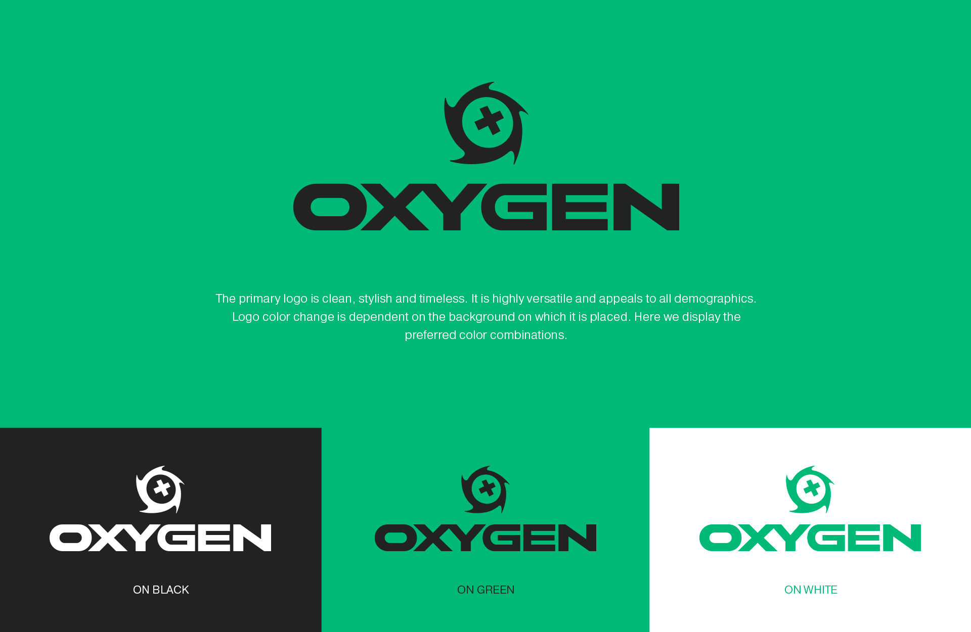
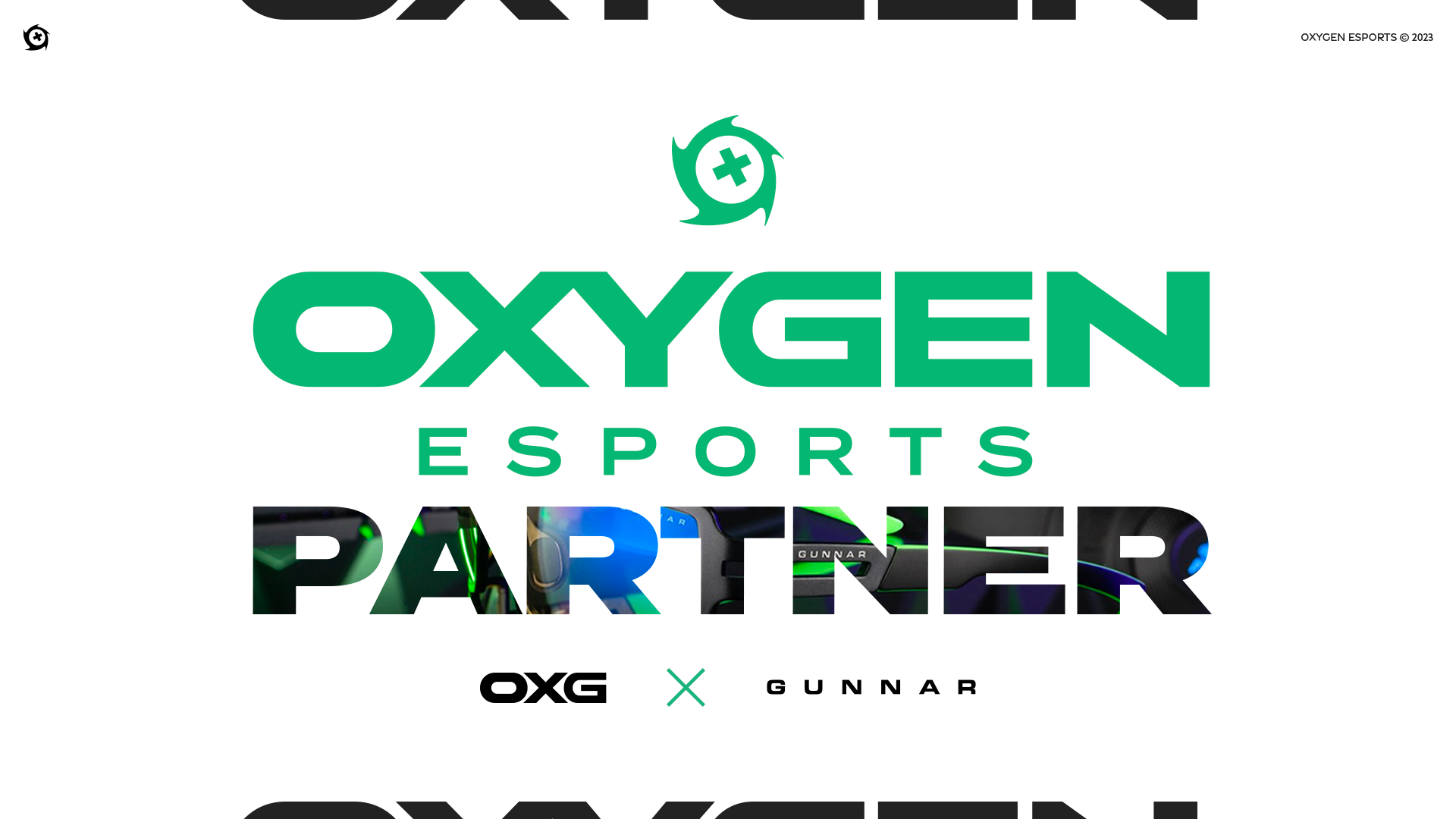
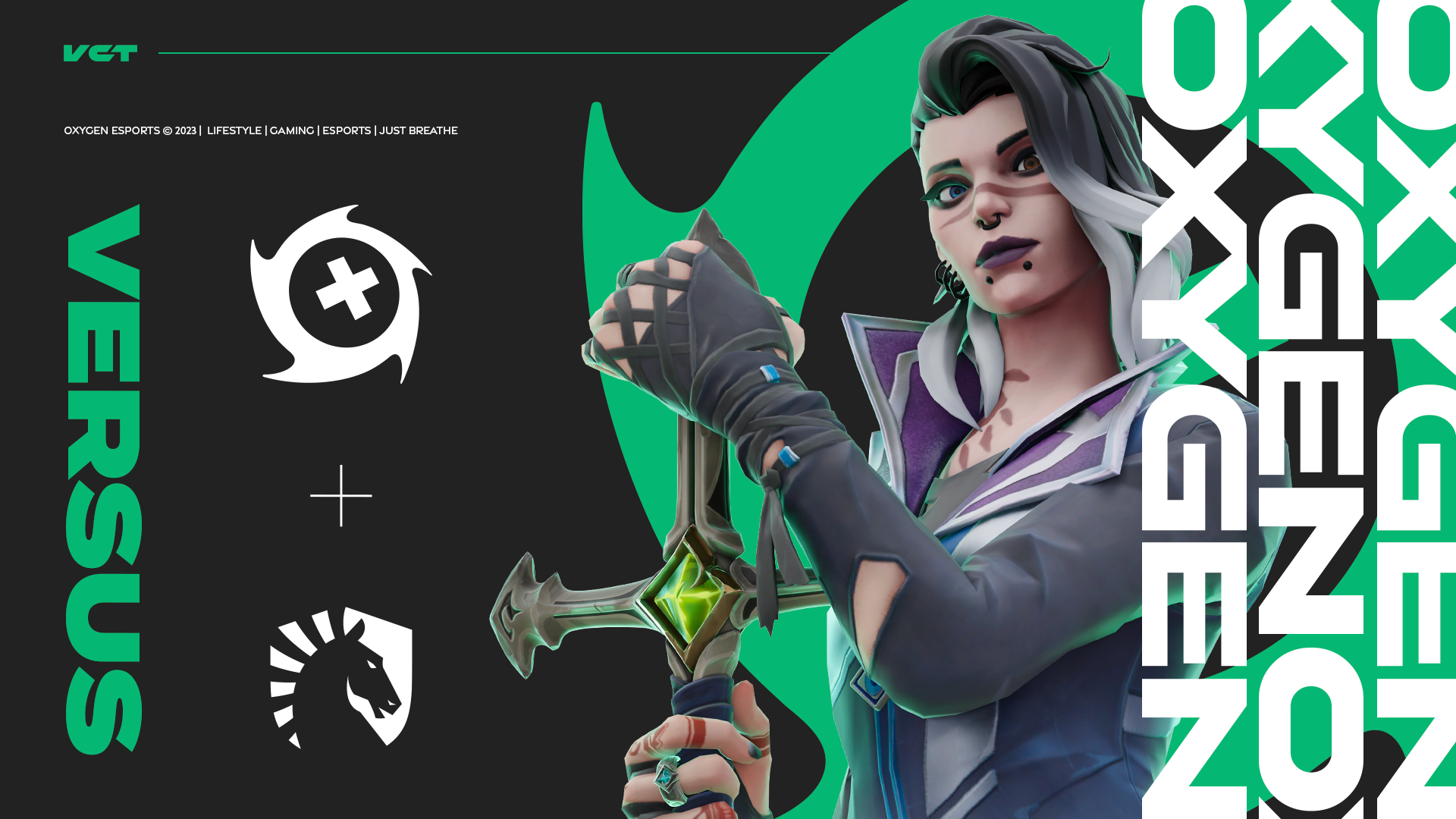
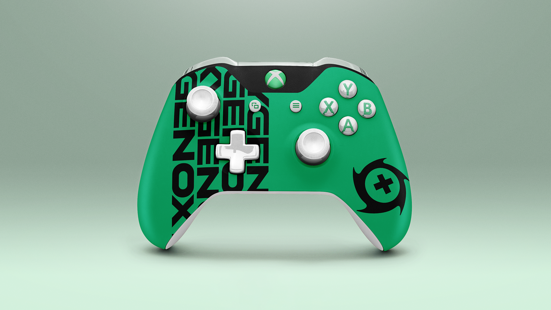
- We designed a clean, timeless wordmark and a storm icon whose center swaps per team, with Breach's X as the default.
- Sharper, modern colors kept it welcoming while adding a competitive edge, and a style guide made the system consistent across teams and partners.
03 // The Work
TheWork
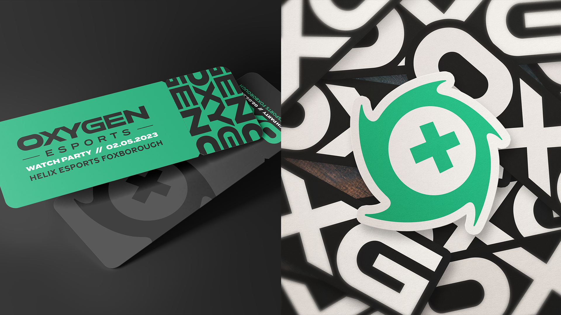
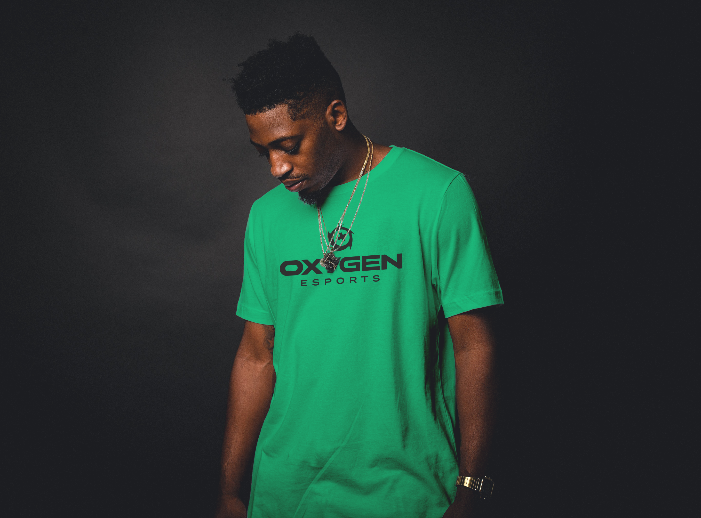
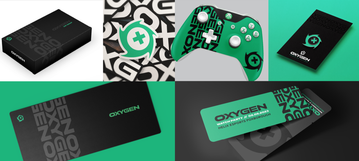
Selected visuals from the project.

04 // The Results
TheOutcome
Oxygen and Boston Breach consistently ranked at or near the top of their competitors month over month for engagement, impressions and sentiment. The unified system made every team instantly recognizable as OXG.